Chemistry Faculty Introduction Board
Purpose
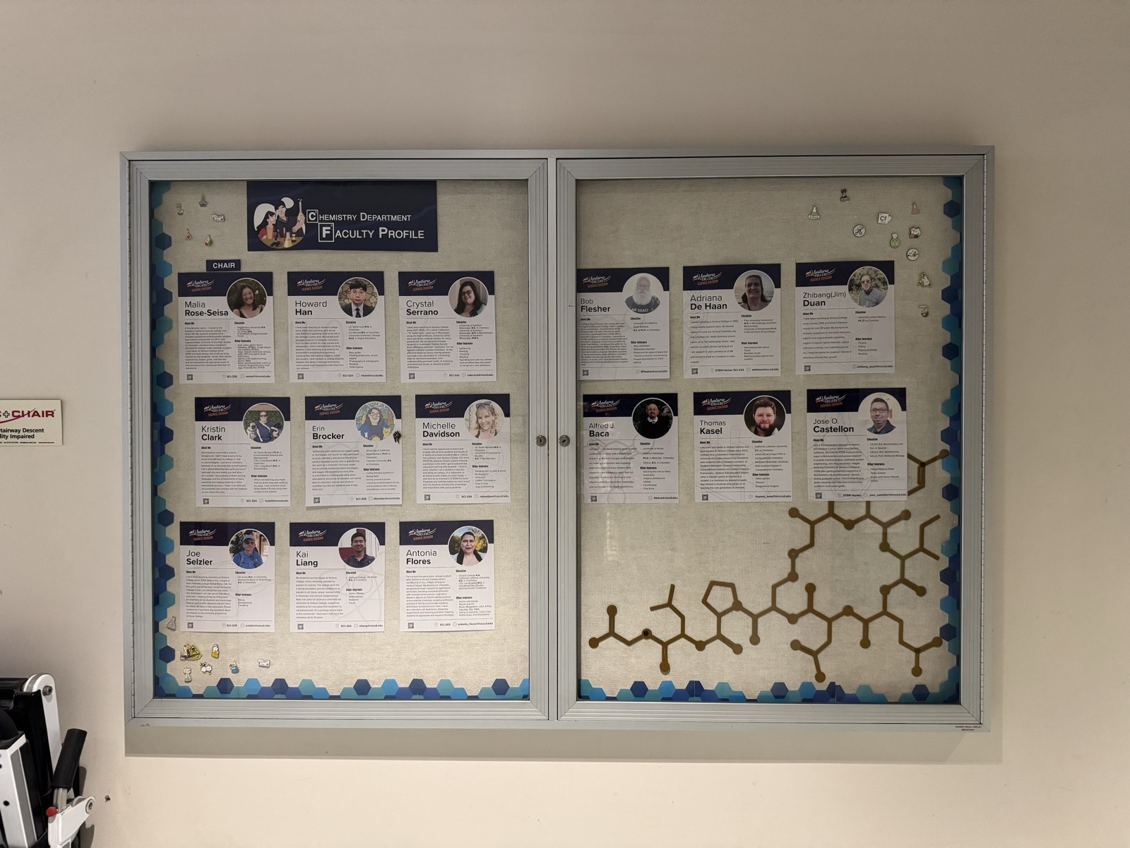
We turned an underused hallway display case on the third floor of the Science Building into a Chemistry faculty introduction board to improve visibility, student–faculty connection, and departmental identity. The goal was a board that is clean, durable, and easy to update, showing each instructor's profile alongside quick-access links for students.
My role
I was the design and implementation lead from concept through print production, and I kept faculty, lab staff, and the division lead informed along the way. That meant drafting the initial concept and presenting prototypes for group feedback; reconciling several style preferences through iterative samples; building and running a Google Form to collect bios and photos; scheduling a photo session for those who wanted professional consistency; monitoring submissions and adapting when the form malfunctioned by accepting email responses instead; testing multiple print vendors to compare color accuracy, finish, and cost; and documenting changes and approvals so the decisions stayed traceable.
The division lead defined the content fields, oversaw branding, and approved the final purchase; a lab technician assisted with reminders, vendor research, and installation; faculty contributors supplied bios and photos and reviewed proofs.
The board
- Profile card system — modular tiles on a consistent grid, with a shared icon set and a QR code.
- Information set — name, office, email, a short "about me," education, interests, plus an optional specialty tag and role label.
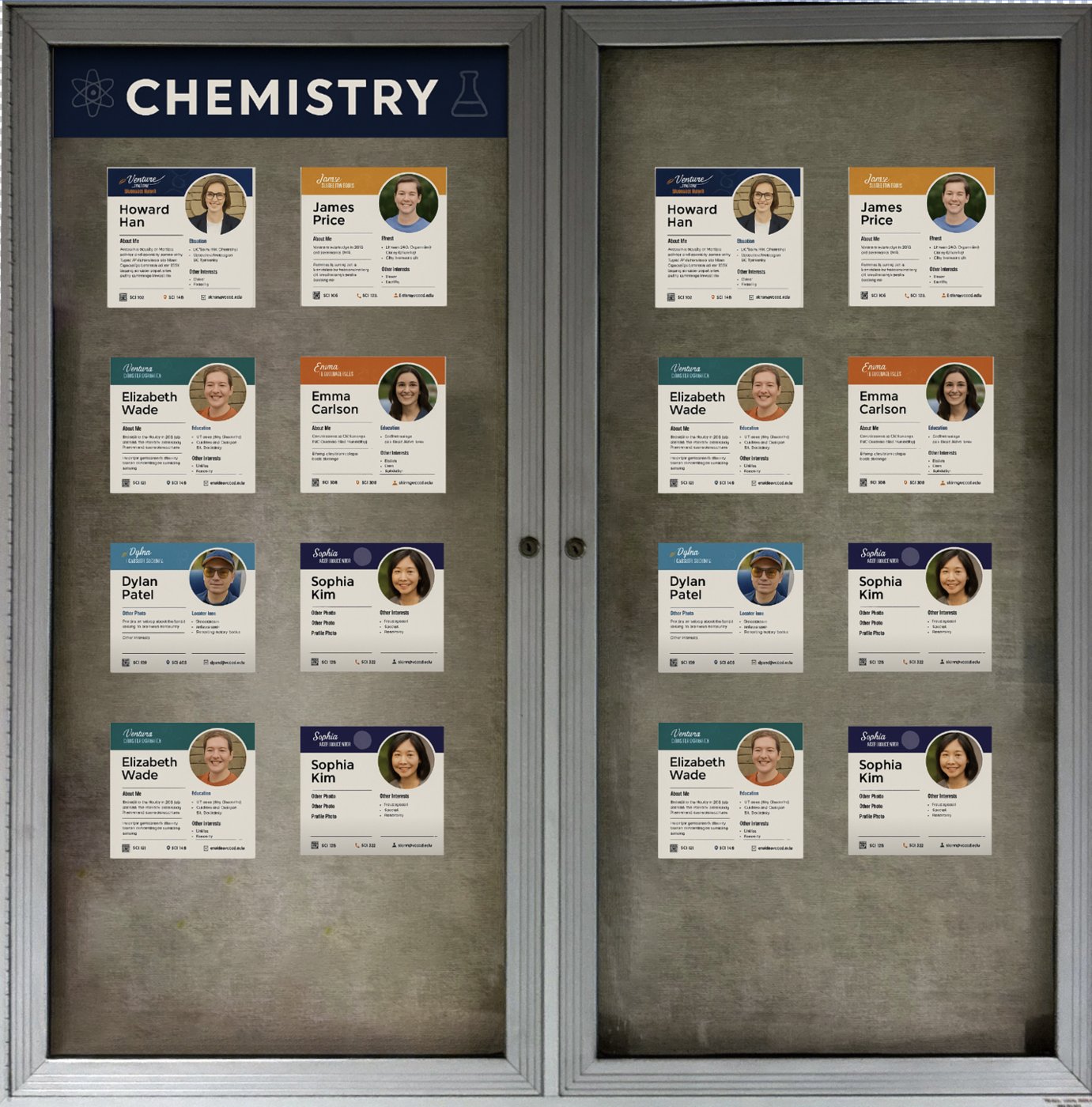
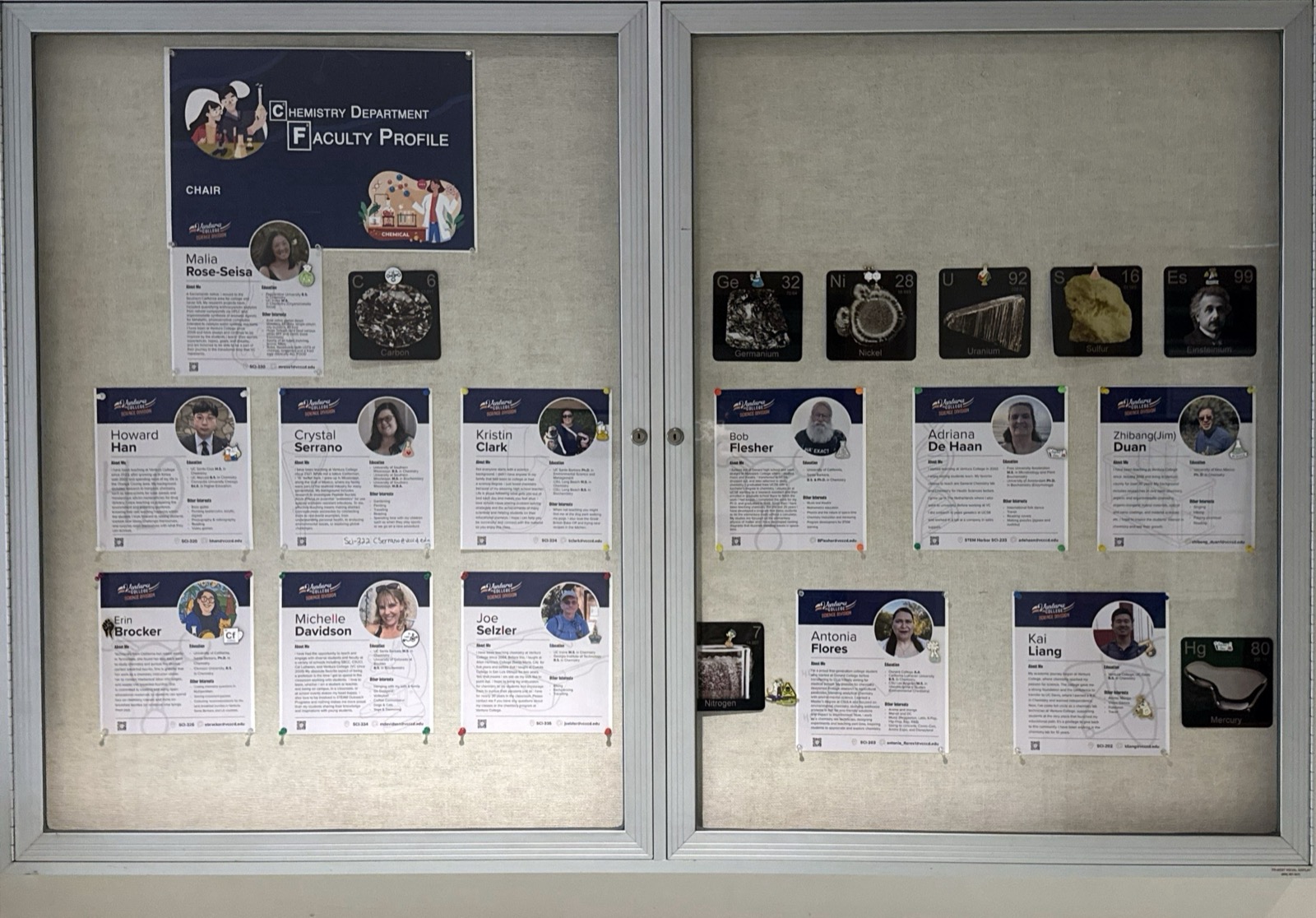
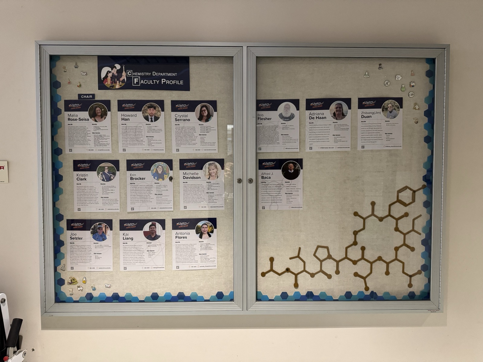
- Scalable layout — cards designed at 9 × 9 in and planned as a 4 × 4 array for sixteen profiles, later redesigned at 9 × 10 in for readability, with alternating left/right blocks. Each card is printed scaled to fit a letter-size sheet. At installation I arranged the cards to fit the display case, and later rearranged them three across in each door.
- Wayfinding and updates — QR links to the division and faculty pages; outer acrylic holders for rotating event flyers.
Process
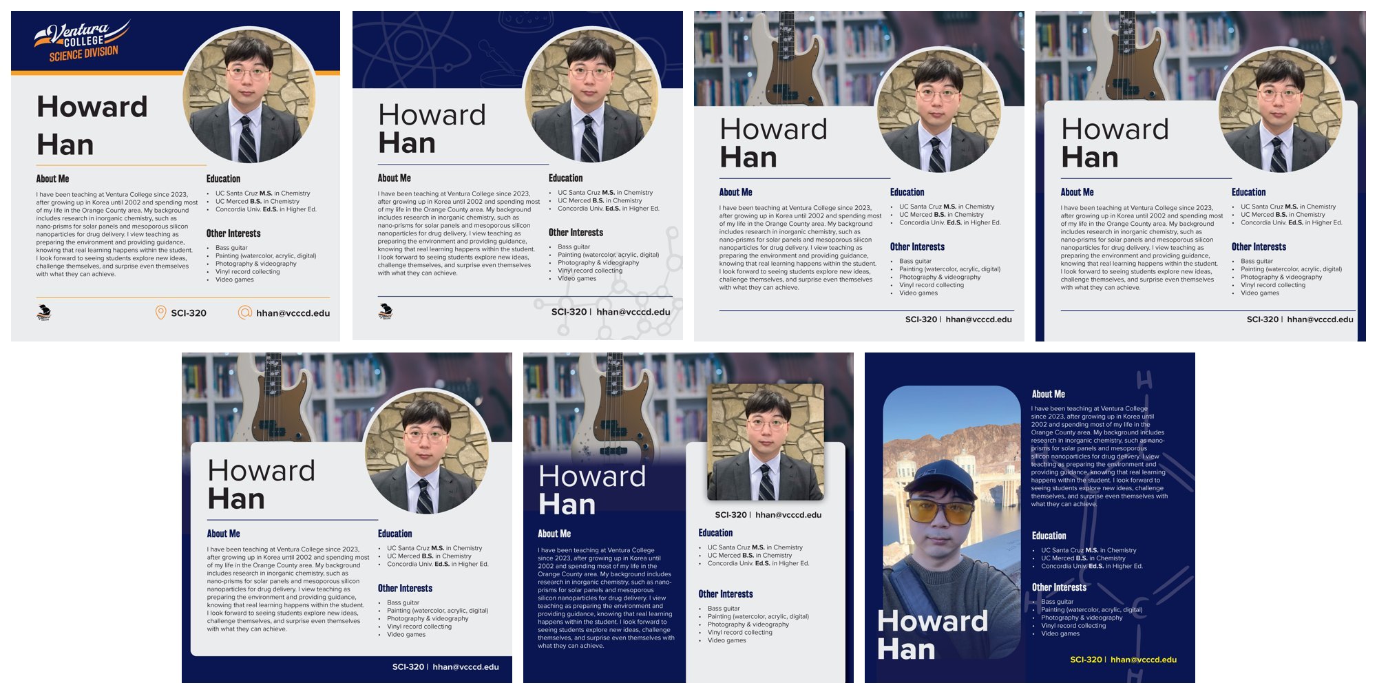
Seven prototypes were produced, from minimal to more decorative, with icons and branding restored per feedback and position labels added. Data came in through a structured Google Form with word limits, backed by reminders and scheduled photo sessions. For print, we compared copy-center and FedEx output and tested gloss against matte, landing on 100-lb matte cardstock for clarity and tone balance, with a letter-size option kept as a cost-efficient fallback. Feedback through the review rounds was consistent (readable font, softer background, professional but friendly), and the division authorized the purchase once the files were resized and finalized.
The cards were built in InDesign and the images prepared in Photoshop. The layout is a frame-based template: each card is a set of fixed frames, so a new photo drops into place. With twelve profiles arriving at different times and in different formats, that is what made the set practical to assemble and, later, to add to.
Design rationale
Legibility came first, so the type is enlarged, the contrast is balanced, and the spacing is generous. Icons make the card quick to scan, and the QR code replaces text that would otherwise clutter it. The modular layout means future additions and replacements need no redesign. The VC logo, a chemistry color palette, and unified typography give the department a visual identity in the building.
Maintenance
The update workflow is deliberately short: faculty submit through the form or by email, the template is updated, cards are batch-printed, and the installed set is swapped. External acrylic holders carry announcements and division flyers, and the QR codes link to the department's official pages.
In fall 2026 the board took three new cards, for part-time instructors who joined the department this semester: one early in the term and two more on September 29, each collected through the same Google Form and built from the existing template. It now holds fifteen profiles.
Reflection
Before Ventura College I spent several years on staff at a church in Orange County, a few of them leading its media team. That work was posters, slide decks, event graphics, and printed programs, designed on a deadline for a group of people who all had opinions about it. I did not expect it to come up again in a chemistry department, and it turned out to be the part of my background this project drew on most.
Coordinating among faculty meant balancing preferences that are easy to underestimate: how each person wanted to be represented, how formal the tone should be, how much visual personality to include. Reconciling those took the same thing it took at the church: showing samples instead of describing options, iterating, following up. The project was shaped by small steps: testing a print sample, revising a layout after feedback, adjusting the form so others could join more easily.
I would like to keep using that experience here.