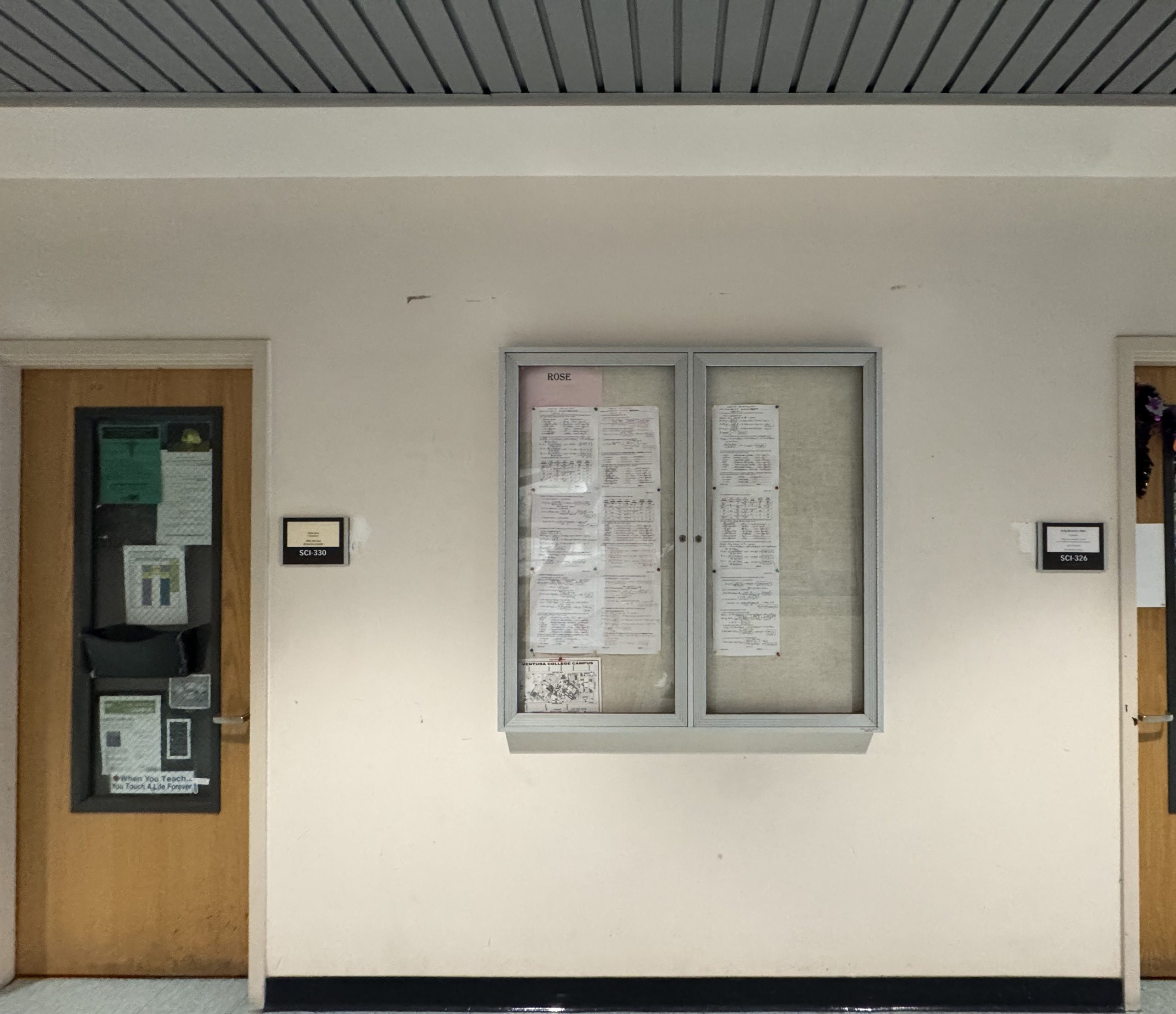
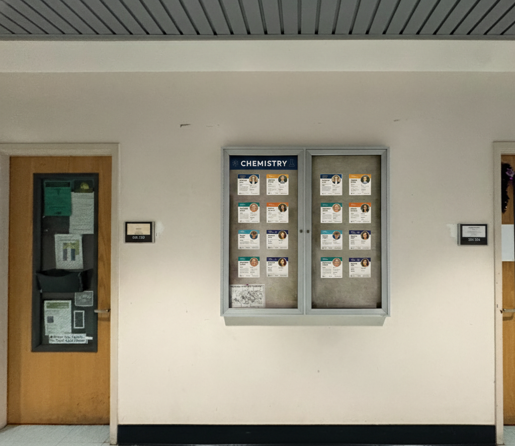
Purpose & Context
We transformed an underused hallway display case into a Chemistry faculty introduction board to improve visibility, student–faculty connection, and division branding. The goal was a clean, durable, and updatable board that highlights each instructor’s profile alongside quick-access links for students.
![]()
My Role & Coordination Approach
I served as the design and implementation lead, coordinating the process—from early concept to print production—while maintaining open communication between faculty, lab staff, and the division chair.
Specifically:
- Drafted the initial design concept and presented prototypes for group feedback.
- Balanced aesthetics with practicality, reconciling multiple style preferences through iterative samples.
- Created and managed the Google Form system to collect bios and photos efficiently.
- Scheduled a photo session for those who preferred professional consistency.
- Monitored form submissions, reminded contributors, and adapted when the form malfunctioned by allowing email responses.
- Personally tested multiple print vendors (copy center, FedEx, Shutterfly) to compare color accuracy, material finish, and cost before recommending the final production route.
- Documented all changes and approvals, ensuring transparent communication and traceability.
This coordination allowed the project to move smoothly despite different schedules and design opinions, and ensured that every faculty member’s profile would appear consistently within one unified visual framework.
Collaboration & Roles
- Division lead: defined content fields (office/email/phone; education; specialties), oversaw branding direction, and approved final purchase.
- Operations partner (lab tech): assisted with reminders, vendor research, and installation logistics.
- Faculty contributors: provided bios, photos, and feedback; reviewed proofs before finalization.
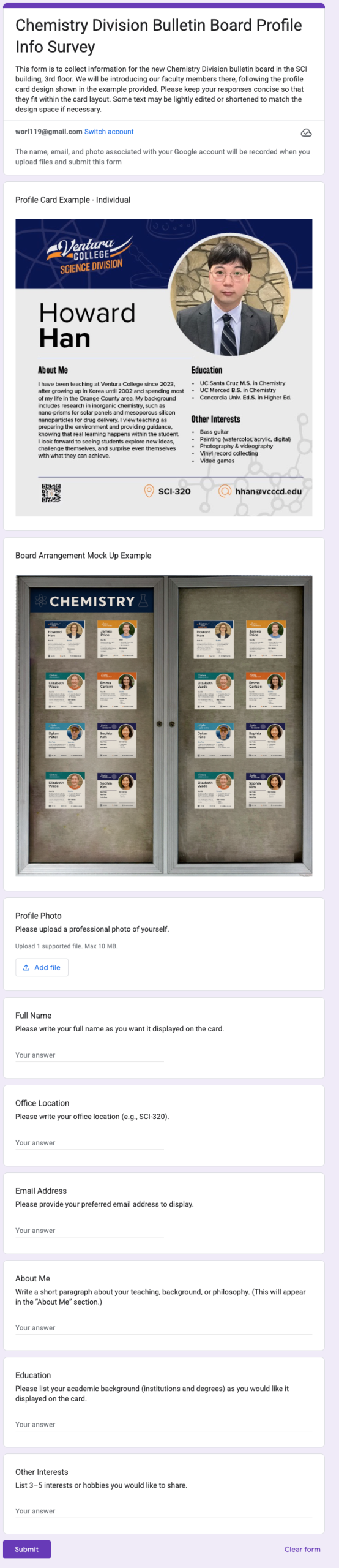
What We Built
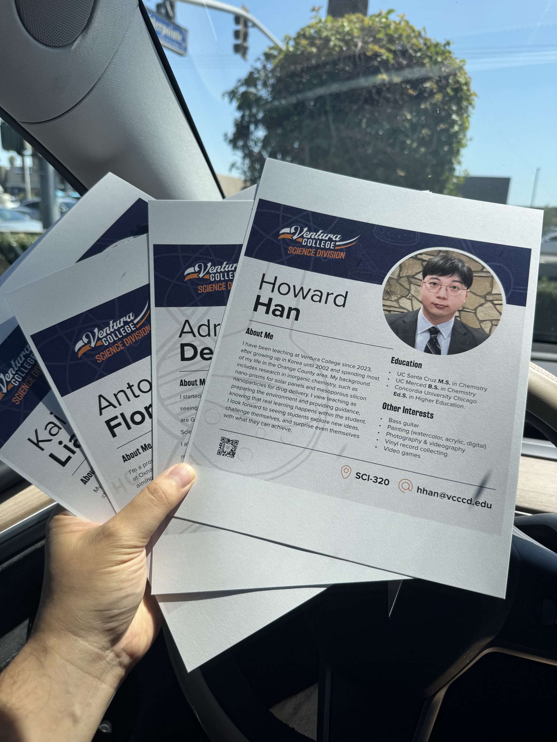
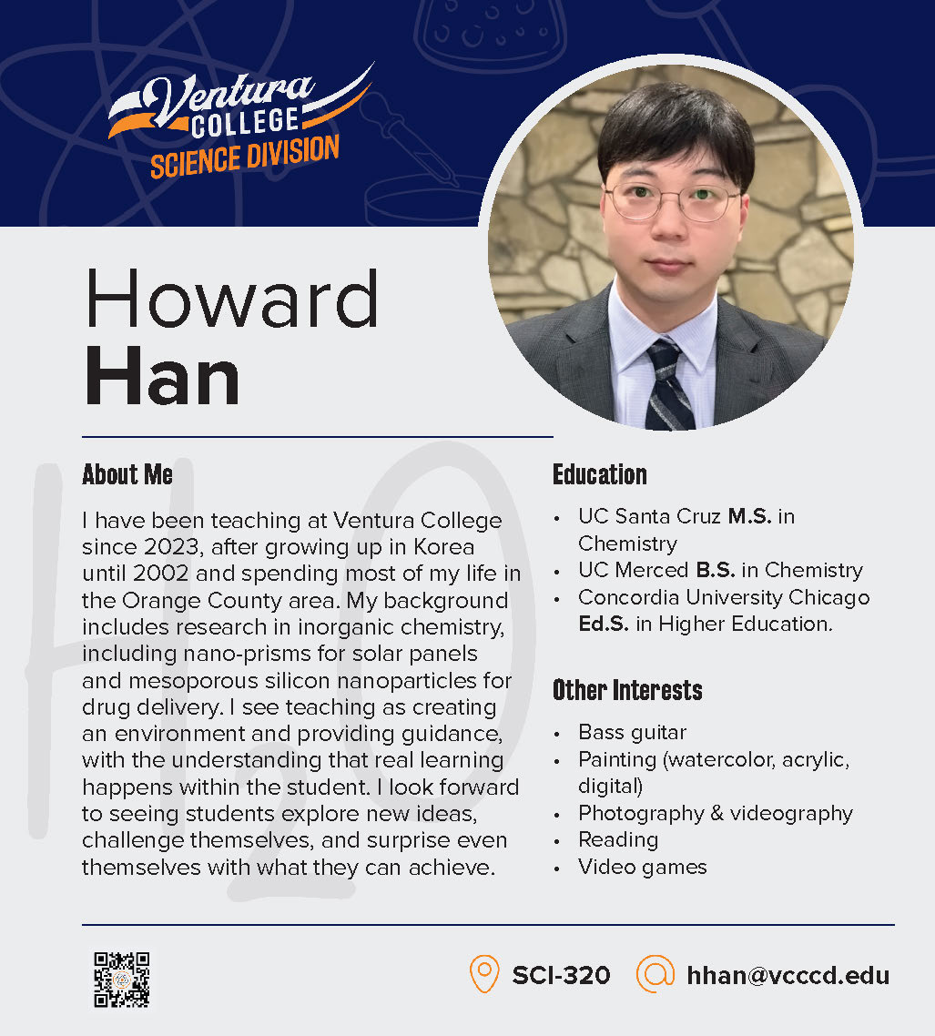
- Profile card system: modular tiles with consistent grid, icon set, and QR.
- Information set: name, office, email, short “About me,” education, interests; optional “specialty” tag and role label (e.g., Chair).
- Scalable layout: base 9″×10″ cards
Wayfinding & updates: QR links to division/faculty pages; outer acrylic holders for rotating event flyers.
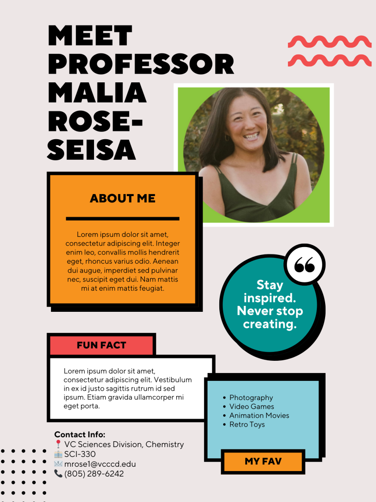
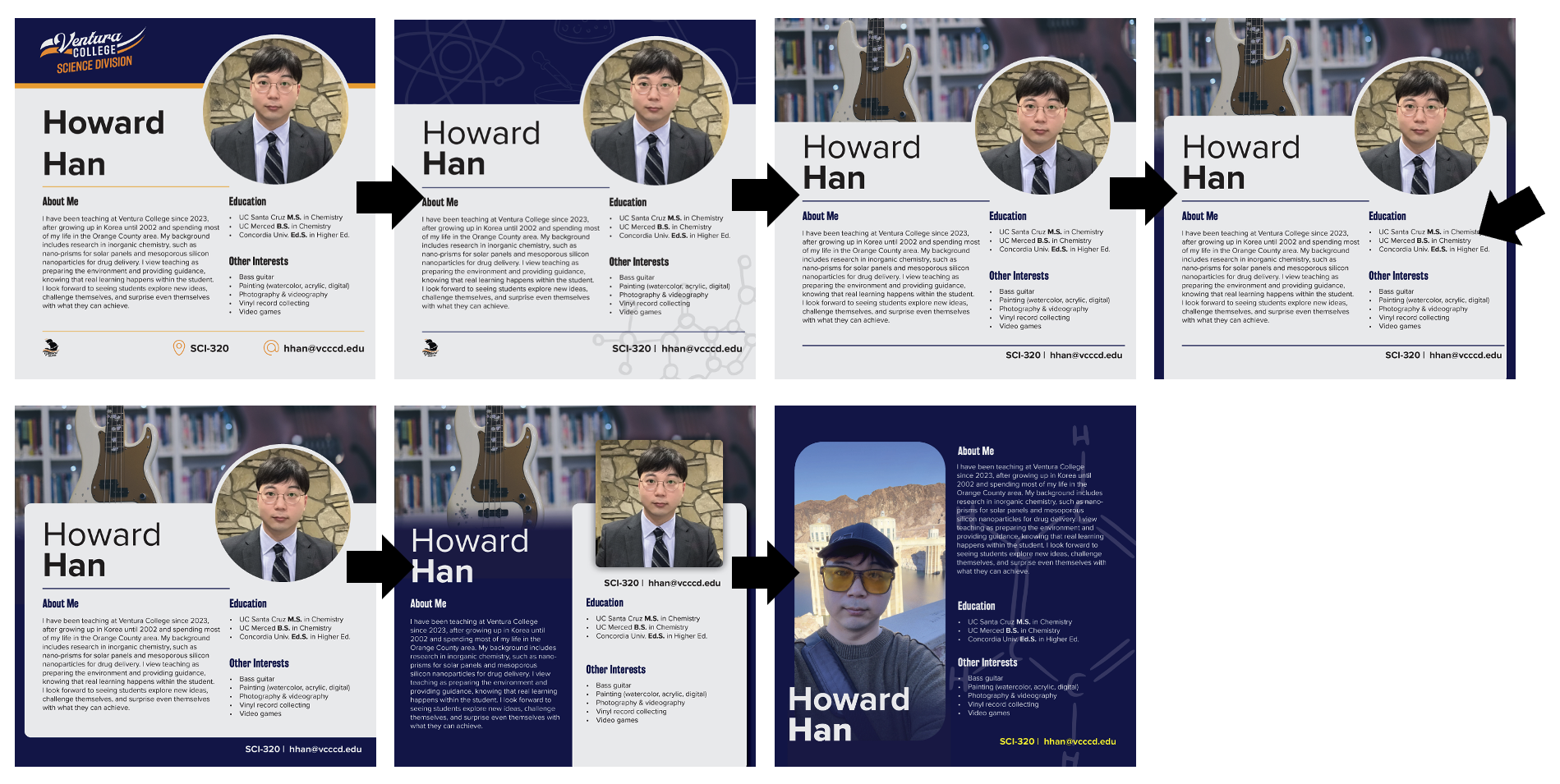
1. Initial Prototype
Requested inclusion of contact info, education background, specialties, VC logo, and QR code.
2. Iterative design
Produced seven prototypes from minimal to more decorative styles to visualize the direction of the design.
3. Data collection
Implemented a structured Google Form (with word limits); coordinated reminders and photo shoots.
4. Print & quality testing
Compared copy center and FedEx color output; tested gloss vs. matte finish; recommended FedEx 110-lb cardstock for clarity and tone balance.